Email Reports
Get actionable data and visuals at a glance – no need to crunch these numbers.

Engagement Marketing Manager
@ Airbnb
You have a team of loyal email geeks at Airbnb.
Head of Fan Engagement
@ NBA
MailCharts has helped us stay up-to-speed on email best practices and innovation, and has served as a source of inspiration as we look to up our email game.

Content Marketing Manager at AWeber
I'm loving the platform. We're updating a lot of our email template designs and the examples we're getting from Mailcharts are really helpful.
Strategic Account Director at Cheetah Digital
Unfortunately I gave up on tracking a gmail inbox as I never managed to sort through it!
Why you’ll love the MailCharts reporting
- View year-over-year or month-over-month data in a single chart or graph
- Understand top-performing content such as subject line length and keywords
- Compare brands against benchmark data from brands in the MailCharts Index
- Get benchmark data on any brand in the MailCharts Index, from brands in dozens of e-commerce industry groups, or from custom groups you create and share with your email teammates.
- Exporting images and data from single emails or batches to enrich reports, visuals, and presentations takes just a couple of clicks.
What’s in our reports?
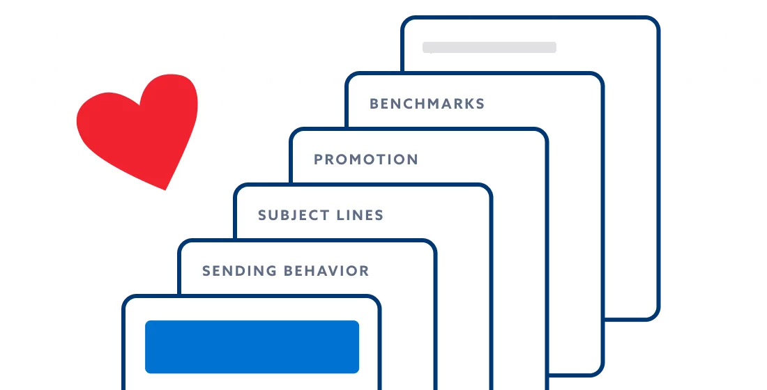
MailCharts reports are the culmination of all the great things that make MailCharts, well…MailCharts! Once you’re in the MailCharts app, there are 5 reporting sections available in industry groups or brand pages including:
1. Sending Behavior
In this report, viewers can analyze sending volume, trends, and activity from industry categories or specific ecommerce brands and compare their data against benchmarks. With this information, they can then identify gaps and opportunities to improve their email program’s cadence and send time

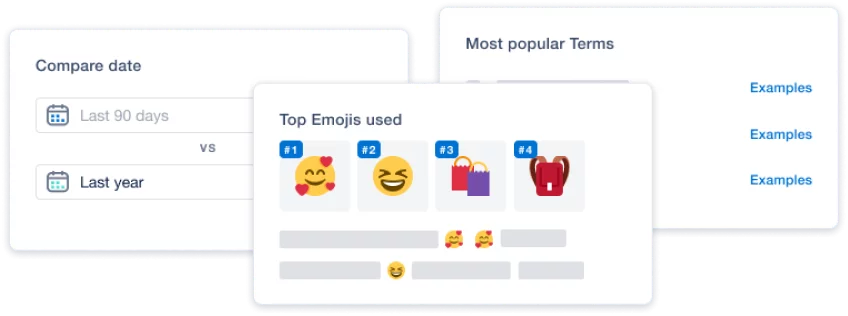
2. Subject Line
This report shows the popular and significant terms used in a category or particular brand as well as subject line length and examples of each. This data is helpful for ideating subject lines in the future and differentiating your ecommerce brand in the inbox. In addition to inspiring future subject lines, the popular and significant terms can also help brands understand historical data of an industry or group.

3. Promotions
In the promotions reports, you get an understanding of promotional trends and activity within a brand or ecommerce category. The comparison tools within this report also allow you to view data YoY/MoM as well as compare promotional activity between like-brands.

4. Benchmarks
Benchmark data helps you compare a brand against hand-picked brands in the MailCharts Index. In addition to comparing brands directly against brands in the MailCharts Index, you can also create benchmarks with curated groups within the MailCharts app.

5. Calendar
Visualization is extremely helpful, especially around key holidays and promotional times. In our calendar report, access year-over-year performance and compare sending and promotional trends following NRF’s 4-5-4 calendar.

Getting the most out of reports
Reports are great, but it’s the insights you pull from them that make them special. Our reports can guide your ecommerce email marketing in the right direction:
Get inspired and create new emails and journeys for your ecommerce email marketing program.
- Understand how other brands are positioning their promotions.
- Pull inspiration from real-brand subject lines and top trends in your industry.
Plan and strategize upcoming calendars and holidays.
- Use the comparison features to view historical sending and promotional activity.
- View sending behavior to inform future A/B testing ideas.
- Quickly look at calendar sends at a high level and any YoY trends.
Compare and benchmark your brand against competitors and peers.
- View an ecommerce brand’s breakdown of key data points and compare them to the brands curated by MailCharts.
- See how you stack up compared to other brands in the MailCharts Index.
- Identify opportunities to change your ecommerce email marketing program based on where your brand falls within the average rates.
Get started with MailCharts
Access thousands of curated email examples, lifecycle journeys, and insights from 2,500+ hand-picked brands in the MailCharts Index..