According to Email Service Provider (ESP) Mailerlite, around 90% of email marketing campaigns sent by their users does not have a custom email preheader text. GetResponse shares similar results, with only 14% of their users adding a preheader text while they also recorded that emails with custom preheader text get higher open rates than those without.
That means that by taking the time to optimize just this one line, you can both stand out from the competition in your subscribers’ inboxes, and boost your open rates.
But what exactly is an email preheader text? How long should it be? And how do you craft one that gets results? Read on to find out.
What is an email preheader text?
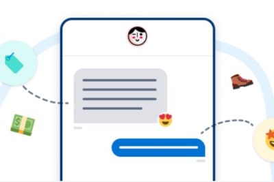
The preheader text is the line of text you see alongside or below the subject line of an email in your email inbox, depending on which email client and inbox view you use, as well as whether you’re checking your emails on desktop or mobile.
Preheader texts give a quick summary of the email but are also often used to incite curiosity and give the recipient a compelling reason to click, thus increasing the chances of the email being opened. That’s why they’re also known as “email preview texts”.
Sometimes, the preheader text is also referred to as the Johnson Box after direct response marketer Frank Johnson. He came up with the strategy to place an introductory text right at the top of a direct response sales letter to draw the prospect into his message even before directly addressing them.
In other words: the email preview text offers you some valuable real estate to build on and entice recipients to check out your email content.
You can write preheader text to your emails by using HTML and CSS, or by creating your emails with an ESP that lets you customize preheader texts without the need to code. Unless you’re a pro email coder, doing the latter is often the safest and easiest way to go.
What Is the Ideal Email Preheader Length?
Your email preheaders should be between 40 and 100 characters long to make sure they appear clearly in both desktop and mobile email clients. As all email clients display email preheaders differently, there is not one ideal email preheader length.
However, mobile clients tend to have a lower character limit for preheader texts than desktop clients, and the longer your email subject line, the fewer characters of your preview text will be shown, so keep those things into account.
One thing you can do is test your email preheaders by sending a test email to yourself and then checking it across the most popular email clients as well as on different devices – both mobile and desktop. Additionally, if you have data on which email client your subscribers use most, you can optimize your preheader text for that client while making sure it still works on others as well.
7 Examples of Preheader Email Texts for Ecommerce
There are various ways in which you can use email preheaders to boost your email opens. You can find some of the best ones below, including examples straight from the MailCharts database.
1. Ignite curiosity
Email subject lines are often used to ignite curiosity in the recipient so that they’ll open the email to see what it’s about. You can also use your preheader text to induce curiosity and make want to open your email.

Pixers lures the recipient in by suggesting they know what their dream interior looks like. The included call-to-action (“Look what we’ve chosen”) makes the recipient even more curious to see which items Pixers thinks would work well in their home. This preheader nicely compliments the subject line, which also creates a sense of curiosity by mentioning interior design ideas without specifying what they are. It grabs the attention of any recipient who is thinking about how to manage an interior design project.
The above is just one of many ways to make your email list curious. You can also use the preheader text to:
- suggest you know something they don’t, and can learn about in the email.
- ask a question they’ll find an answer to within your email.
- start a statement you then don’t finish, …
2. Add a clear call to action

Rent the Runway’s subject line and preheader text make for a great combination. If you want to stop wearing your sweats, get their eight clothing items a month subscription plan and always have something nice to put on. On top of that, the email preheader is a clear call to action (“Try”) and includes an incentive (‘$99/month your first two months”) for the recipient to sign up. It’s a great way to get more clicks.
3. Expand on the subject line

Another example of the subject line and preheader working well together is this email from H&M. Its great subject line announces “earth-friendly styles” while the preheader text continues to let you know these eco-conscious styles are currently on sale.
Most email clients display only 30 to 75 characters of email subject lines but add the preheader text to that and you suddenly have around 100 characters more to convince the recipient to open your email. Making the subject line and preheader work together is a great way to share more details.
4. Replace a statement with a question
Instead of adding a straightforward call to action to your email preheader, try using a question instead to draw attention. This forces the reader to engage, which pulls them into your email even before opening it.

Fingerhut does a good job of this in the example above. Instead of advising the recipient to reset their eating habits by ordering more healthy foods, the brand asks their subscribers whether they need to reset their meal plan. A recipient who sees this preheader and goes “Yes, that’s me!” will surely open the email and read on.
5. Experiment with emojis
Once belonging to the realm of chat messages and forum threads, emojis are everywhere now – including in email marketing. Still, they’re riskier to implement than any of the strategies mentioned above and if you aren’t sure how your audience will respond to them, it’s best to run a small test first.

Framebridge makes smart use of the heart emoji in both the subject line and preheader text as when you open their email, you see that they’re promoting a heart-shaped picture frame.
It won’t always be this easy to perfectly align your preheader emoji use with the content of your email so instead, you can use emojis to emphasize your message or the emotion you’re trying to convey.
A few examples:
- use a lightning bolt to emphasize a flash sale
- add a sun to announce your summer collection
- use a suitcase icon to launch a new travel product
6. Use personalization

Personalization works, and it can go beyond the subject line or copy of your email. In this example, fragrant spray brand Poo-Pourri addresses its subscriber Arlette in the preheader text. Lots of mobile email clients actually display the preheader text almost more prominently than the subject line and so if Arletta is checking her email on her phone, this line will surely stand out to her.
7. Offer a summary of the email

BFI Shop goes back to the original use of email preheaders by providing a short summary text with what subscribers can expect to find in this email: exclusive discounts on Blu-ray and DVD box sets. The tactic of using a summary text may not be as alluring as the other ones above, but it’s short, simple, and clear, leaving no room for misinterpretation. Sometimes, that’s all you need.
Email Preheader Best Practices
When looking at best practices for eCommerce email marketing, email preheaders deserve just as much attention as subject lines or email body copy do. After all, they are one of the first things your subscribers see when one of your emails pop into their inbox.
Below are some general email preheader best practices to follow to increase your open rates.
1. Always add preheader text yourself
If you don’t add an optimized preheader text to your email campaigns, the email clients your subscribers are using will auto-generate one. In other words: you’re leaving a piece of prime inbox estate over to chance.

If you’re pressed for time and can’t come up with an enticing preheader text, simply go for a summary of your email campaign. Something like “Open to find crazy deals inside” is still better than the “View this email in your browser” we see when the above email from Pimoroni lands in our inbox.
2. Put the most important part first
As your preheader text might get cut off depending on the email clients your subscribers are using, it’s best to put the most important part of the text at the front. That way, you can still get your message across even if it’s not entirely shown.

While ThirdLove’s preheader text gets cut off, no crucial information gets lost. Subscribers can read that they can save up to 30% on all styles and thus save some serious money. Whatever comes after that, isn’t part of the email preheader’s core message.
3. Make preheader text long enough
You may be tempted to craft short email preview text to prevent it from being truncated. Doing so, however, carries the risk that the email preview text won’t take up all available space, at which point email clients might still pull in the first line of text of the body of your email to fill up that space.
If you have a very short preheader text, there’s even a risk that email clients will fill up the remaining space with your unsubscribe line, which is what happened to the email from Daily Cashback Bonuses! below.

That’s why it’s better to craft a longer email preheader with a strong start than to try and cram your entire message into just a few words.
4. Avoid repeating subject lines
Just like having email clients auto-generate your email preheaders, making your preheaders identical to your subject lines is a waste of inbox space. Think of the preheader text as the subheading to your subject line, expanding on it, clarifying it, or building on its message.

Lowes’s subject line and preheader text are practically identical here. They’re neglecting their opportunity to draw the recipient into their email and instead bore them by sharing the same message twice.
5. Keep it human
It may be tempting to list all items you have on sale in your email preheader as BOTE does here:

But this doesn’t exactly read smoothly, does it?
Whatever type of information you want to include in your email preheaders, they’re always going to be read by humans, so write them as such. Compare BOTE’s list of words to Ma Petite Shoe’s easy-to-read preheader text below. Which one draws you in more? It’s probably the latter.

Start Optimizing Your Email Preheader Text to Improve Open Rates
Together with the email subject line, a well-written preheader text allows your email marketing campaign to stand out in your subscriber’s mailbox. Create curiosity, address your subscribers directly, summarize your email or follow any of the other tactics outlined in this article to get a better open rate for any campaign.
Take into account best practices to make the most out of your email preheaders and if you want more inspiration, make sure to sign up for a free MailCharts account so you can view thousands of email examples and their preheader text.